A rocket that can never visually diverge from the line it follows.
- Front-end development and motion design
- 2026
- Corporate Website
Overview
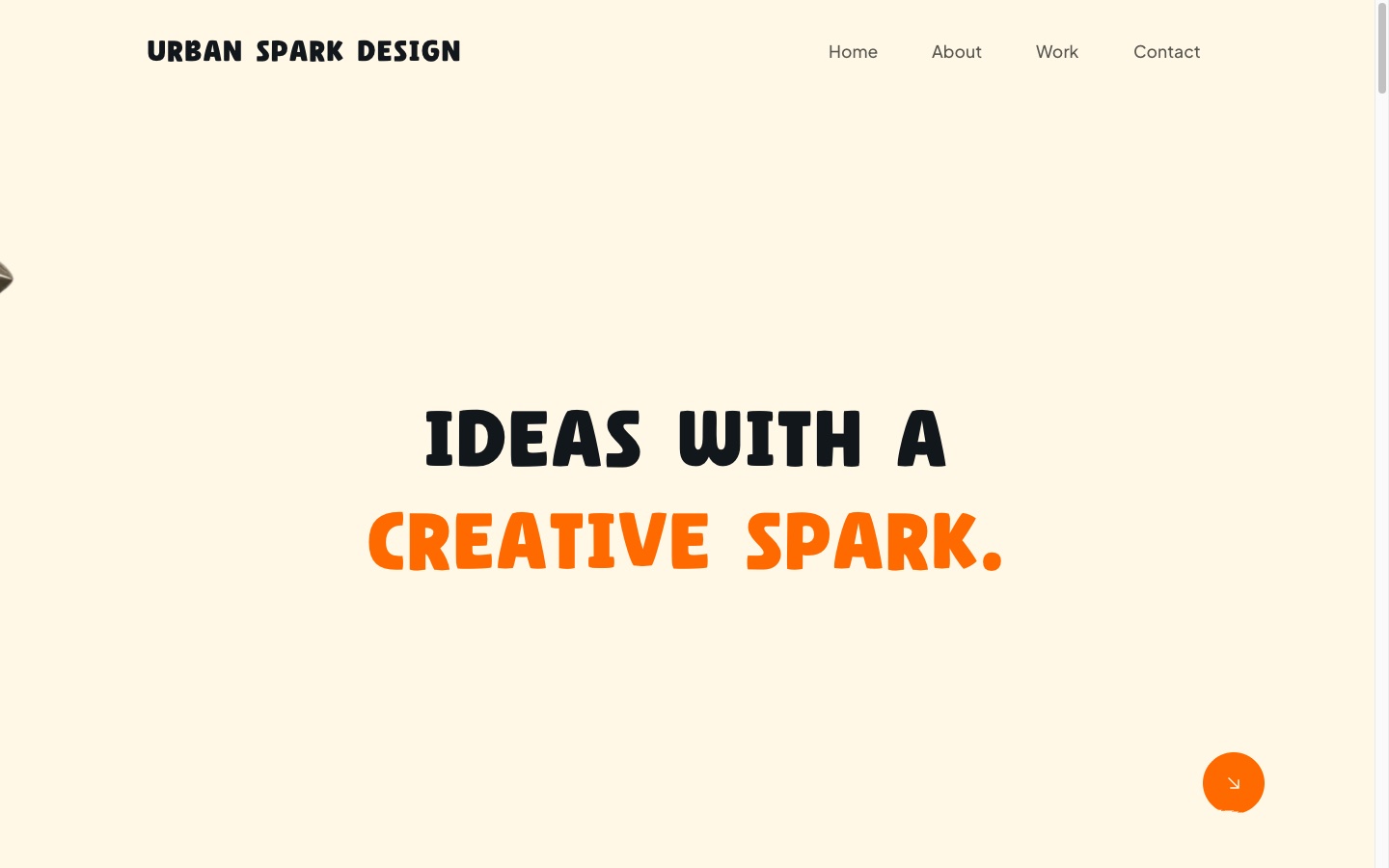
An interactive creative-portfolio site built around expressive typography and scroll-driven motion: word-by-word hero reveals, a torn-paper transition system between sections, a hover-triggered logo interaction, and a custom rocket that flies a hand-tuned, fully responsive SVG path as the page scrolls.
The challenge
The brief called for a genuinely distinctive scroll experience rather than a template with a parallax effect bolted on — which meant a handful of specific, unforgiving problems rather than one big one.
- Reproducing a very particular scroll choreography — pin timing, section-reveal thresholds and path-following motion — with pixel-level accuracy.
- Building a scroll-driven SVG path system that stays correct at every viewport width, not one geometry tuned for a single screen size.
- Keeping a rigid illustrated assembly — rocket plus exhaust flame — correctly anchored to a curved, animated path through every rotation angle it passes through.
- Getting a sticky, progressively-revealed footer to behave correctly across routes with very different content lengths.
- Delivering all of the above without sacrificing a genuinely responsive, touch-appropriate mobile experience.
What was built
The site is a set of self-contained section components — Hero, About, Call Me, Why Work With Me, Work Grid, Footer — each owning its own layout, copy and animation logic, with shared primitives composed across sections rather than duplicated.
- A reusable `Reveal` fade-in-on-scroll wrapper and a reusable project-card/case-study template are shared across every section and every project page.
- A hover-triggered logo interaction — the wordmark’s first letter falls away and is "restored" by an illustrated hand on mouseenter, with a tap-triggered equivalent on touch.
- A full torn-paper section-transition system built from SVG shapes run through an feTurbulence/feDisplacementMap filter — a procedural technique, so every torn edge is unique and fully responsive rather than a static cut-out image.
- GSAP’s ticker is synced to Lenis’s own render loop, so every scroll-driven animation stays in step with the smoothed scroll position rather than the raw wheel input.
- The footer runs two modes from one component: pinned and progressively revealed on the homepage, normal-flow on case-study pages — route-aware rather than two separate footers.
Process
The rocket tracks the line it is drawn on
The flight path is a real SVG path element, styled as the visible dotted line itself — the same element GSAP’s MotionPath plugin targets, so the rocket can never visually diverge from the line it is meant to be following.
Anchored by true visual centre, not a bounding box
The rocket artwork is anchored to the path using its own true visual centre, so it stays convincingly seated on the line through every curve; the exhaust flame is anchored to the rocket’s own local coordinate frame rather than the path or the viewport, so the rocket-and-flame assembly rotates and moves as one rigid object regardless of where it is on the path.
Geometry derived from formulas, not tuned per breakpoint
The rocket lane’s width, its offset from the layout edge, and the dotted line’s own dash styling are expressed as viewport-relative formulas verified across a full sweep of desktop breakpoints, rather than interpolated between a couple of fixed sizes — and scroll progress along the path is tied to the lane’s own height, so pacing stays proportionate regardless of viewport size.
The lane is text-first below the width it needs
The rocket lane only appears once the viewport is wide enough to give it room to read clearly. Below that width the section falls back to its text content alone, rather than compressing a diagram-scale animation onto a phone screen.
Stack
- Next.js
- App Router, with the reusable case-study template powering every /work/[slug] page
- React
- The self-contained section components the page is composed from
- TypeScript
- Application code throughout
- Tailwind CSS
- Layout and fluid, clamp()-based typography and spacing
- GSAP
- The animation core: reveal timelines, pin timing and section-transition choreography
- ScrollTrigger
- Every scroll-linked reveal and pin, including the sticky/reveal footer
- MotionPathPlugin
- Drives the rocket along its SVG path, synced to real scroll progress
- Lenis
- Smooth-scroll feel, with GSAP’s ticker synced to its render loop so motion tracks the smoothed position
Screens

The About section, introducing the studio’s working style. 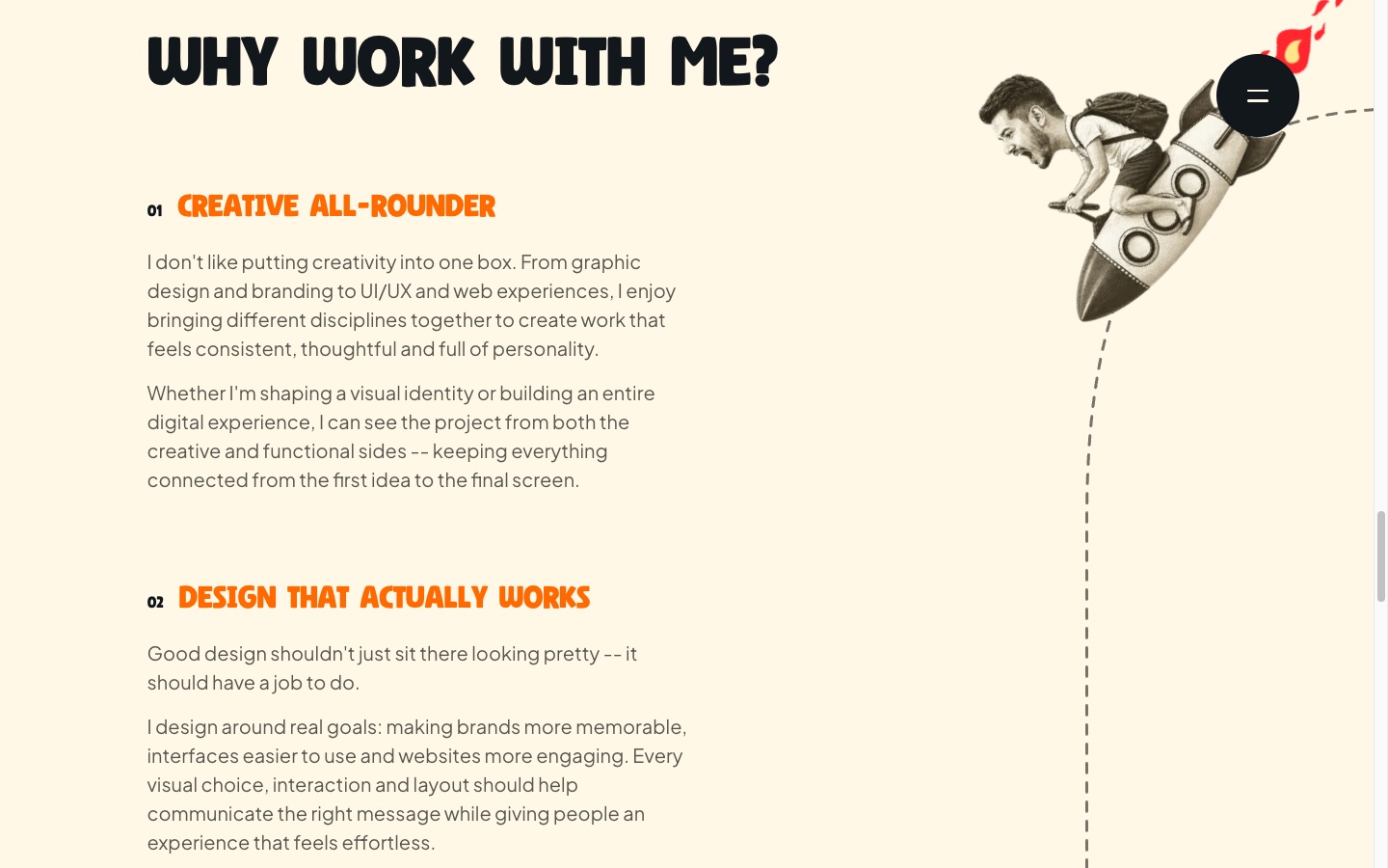
The "Why Work With Me" section at scroll entry, with the rocket at the start of its dotted flight path. 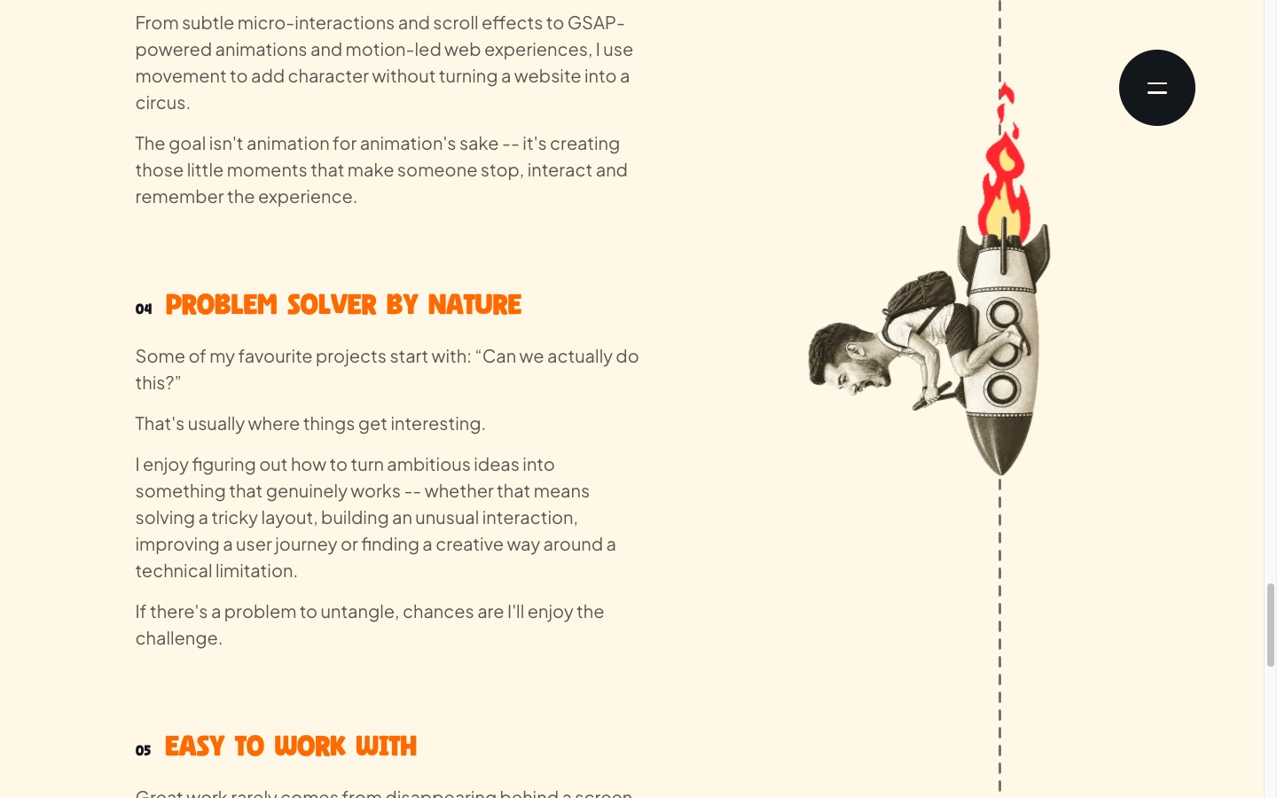
The rocket mid-flight along its path, exhaust flame anchored through the turn. 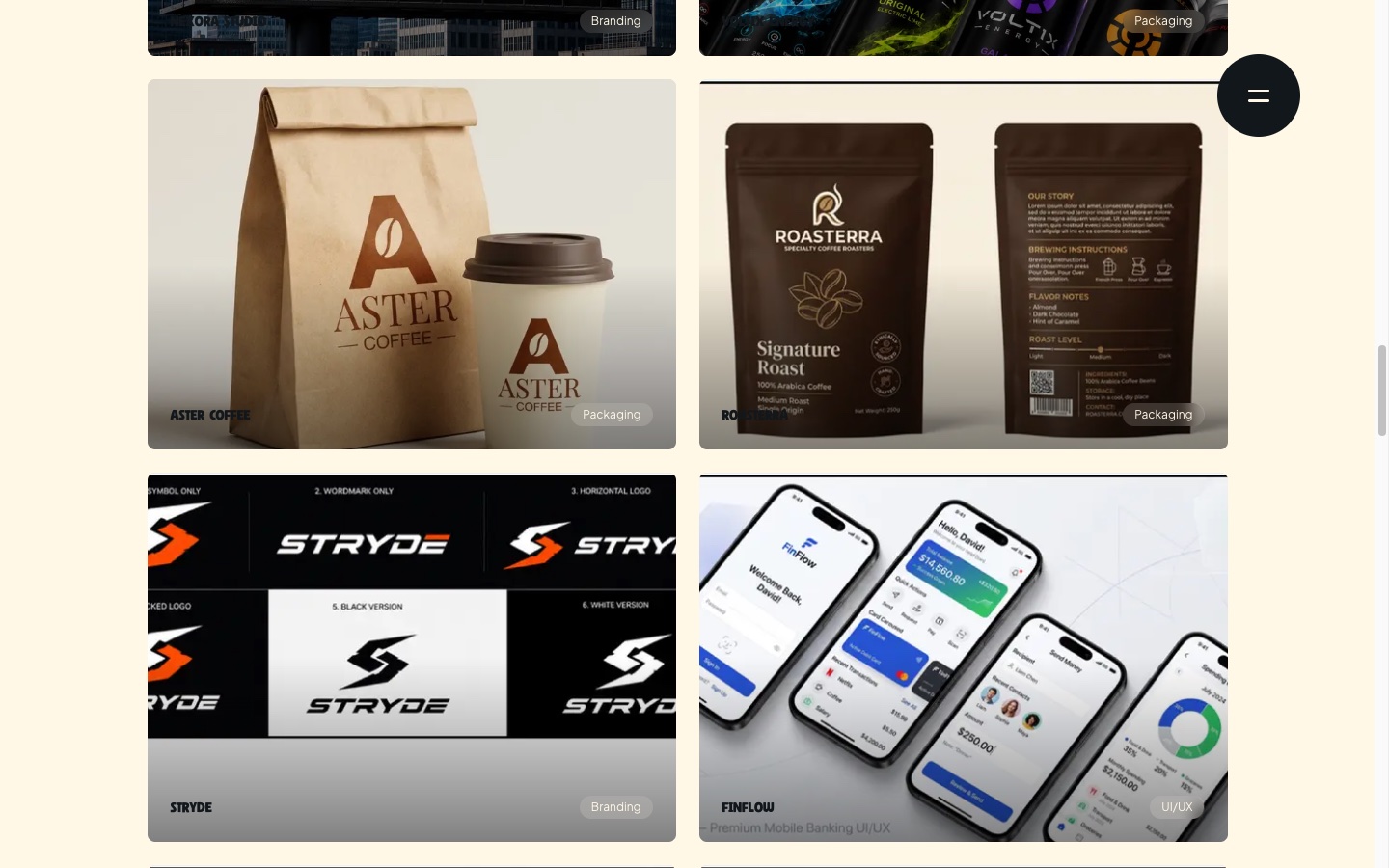
The project grid, showing the site’s card layout and category tags. 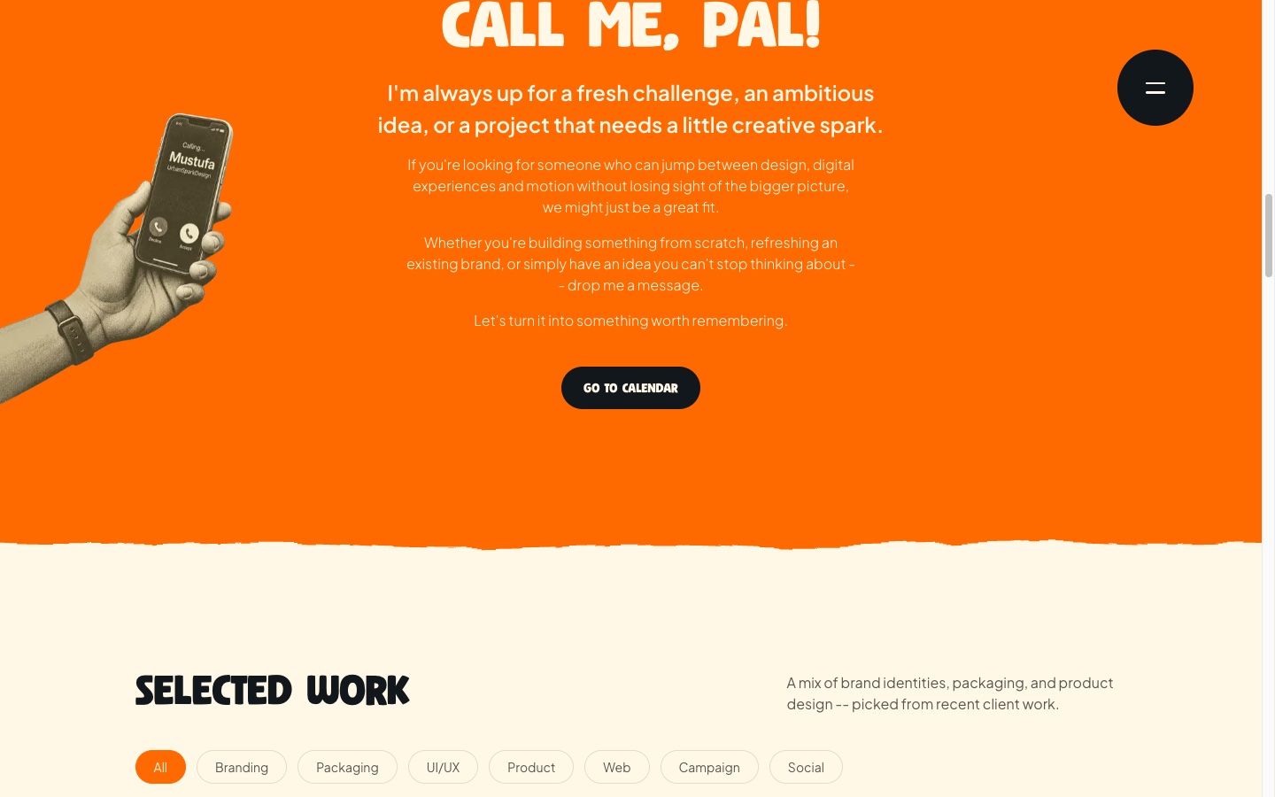
The Call Me section. 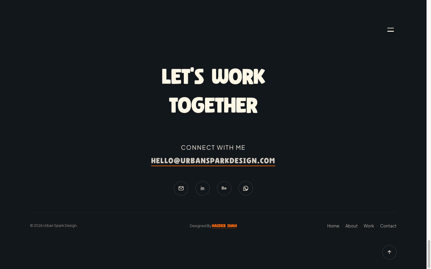
The sticky, progressively-revealed footer, with its site credit. 
An individual /work/[slug] case-study page, built from the site’s reusable template. 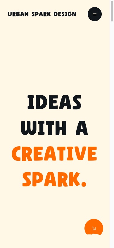
Mobile — the homepage hero at a 390px viewport. 
Mobile — the project grid at a 390px viewport.
Results
No outcome for this project has been verified. There is no measurement, export or client statement behind it, so nothing is claimed here — an empty result is the accurate one, not a placeholder for a number to be filled in later.
Sources
- The project’s own case-study brief and structured metadata (overview, challenges, solutions, features, tech stack)
- The desktop, tablet and mobile screenshots supplied alongside that brief, reviewed section by section
- The reusable case-study template and technology list as documented in the brief